CSS Flexbox
This tutorial explains how to use Flexbox
Here is the complete HTML and CSS code for the Flexbox layout:
HTML
<!DOCTYPE html>
<html lang="en">

<head>
    <meta charset="UTF-8">
    <meta name="viewport" content="width=device-width, initial-scale=1.0">
    <link rel="stylesheet" href="flexbox.css">
    <title>Document</title>
</head>

<body>
    <div class="container">
        <div class="item item-1">Item 1</div>
        <div class="item item-2">Item 2</div>
        <div class="item item-3">Item 3</div>
    </div>
</body>

</html>
CSS
/* BASE STYLES */
:root {
    --clr-dark: #000000;
    --clr-light: #f1f5f9;
    --clr-accent: #c60b33;
}
*,
*::before,
*::after{
    box-sizing: border-box;
}

body{
    margin: 0;
    padding: 0;
    line-height: 1.6;
    word-spacing: 1.4px;
    font-family: 'Roboto', sans-serif;
    color: var(--clr-dark);
    background-color: var(--clr-light);
    display: flex;
    justify-content: center;
    align-items: center;
    height: 100vh;
}
.container {
    width: 80%;
    height: 500px;
    margin: auto;
    border: 10px solid var(--clr-dark);
    }
.item {
    width: 100px;
    min-height: 100px;
    background-color: #ff81a9;
    padding: 1em;
    font-weight: 700;
    color: var(-clr-light);
    text-align: center;
    border: 5px solid var(--clr-accent);
    border-radius: 18px;
    }
 /* END OF BASE STYLES  */

 .container {
    display: flex;

    flex-direction: row;
    /*flex-direction: column;*/

    justify-content: flex-start;
    /*justify-content: flex-end;
    justify-content: center;
    justify-content: space-between;
    justify-content: space-around;
    justify-content: space-evenly;*/

    align-items: flex-start;
    /*align-items: flex-end;
    align-items: center;
    align-items: stretch;*/

    flex-wrap: nowrap;
    /*flex-wrap: wrap;*/

    align-content: flex-start;
    /*align-content: flex-end;
    align-content: center;
    align-content: space-between;
    align-content: space-around;
    align-content: space-evenly;*/

    /*gap: 1em;*/
 }

.item-3{
    /*flex-grow:1;
    flex-shrink:5;
    flex-basis:300px;

    flex: 1;
    flex: 0 0 300px;

    align-self: flex-start;
    align-self: flex-end;
    align-self: center;
    align-self: stretch;

    order: -1;*/
}
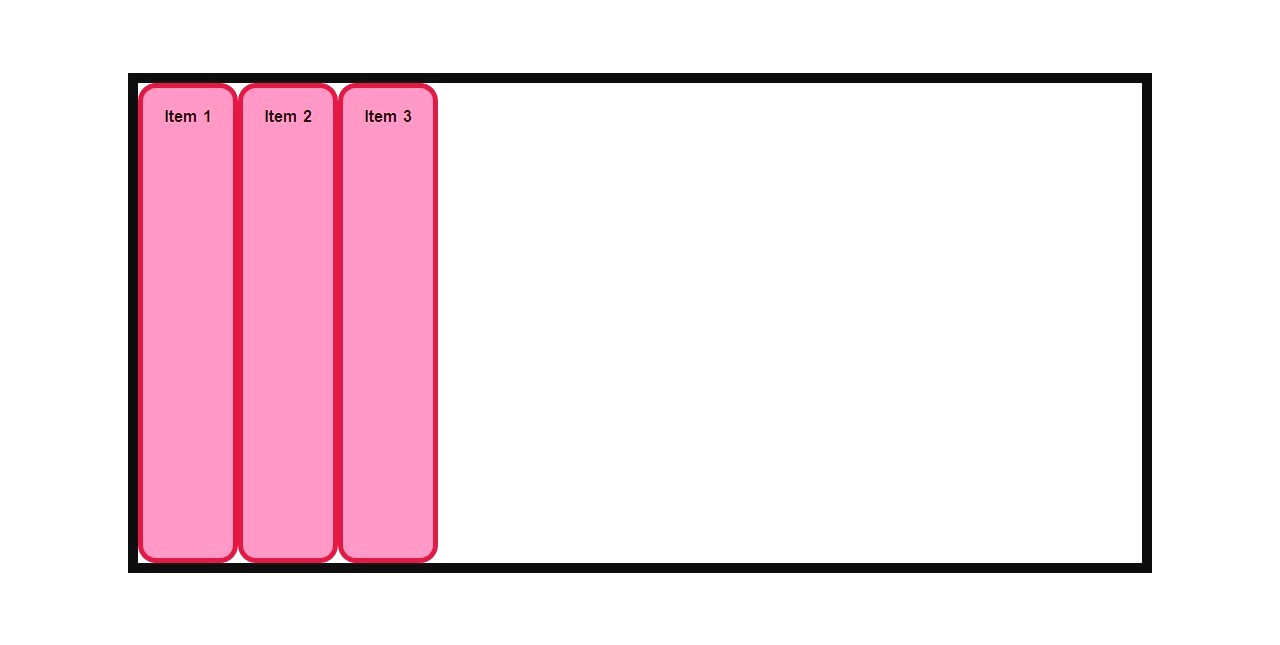
1. HTML Structure
The HTML defines a container with three items:
<div class="container">
    <div class="item item-1">Item 1</div>
    <div class="item item-2">Item 2</div>
    <div class="item item-3">Item 3</div>
</div>
Explanation:
- Container: The
.containeris the parent element where Flexbox properties will be applied. - Items: The
.itemelements are the child elements styled and positioned inside the container.
2. Base Styles
The following CSS defines the base styles for the page:
:root {
    --clr-dark: #ef172a;
    --clr-light: #f1f5f9;
    --clr-accent: #e11d48;
}
body {
    margin: 0;
    padding: 0;
    display: flex;
    justify-content: center;
    align-items: center;
    height: 100vh;
}
.container {
    width: 80%;
    height: 700px;
    border: 10px solid var(--clr-dark);
}
.item {
    width: 150px;
    height: 150px;
    background-color: #fb7185;
    font-weight: 700;
    text-align: center;
    border: 10px solid var(--clr-accent);
    border-radius: 18px;
}
Key Points:
- CSS variables (
--clr-dark,--clr-light, etc.) make colors reusable. - Body Styling: Centers the container both vertically and horizontally with
display: flex;. - Container Styling: Fixed dimensions and border for clarity.
- Item Styling: Equal dimensions, rounded corners, and center-aligned text.
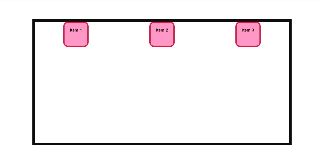
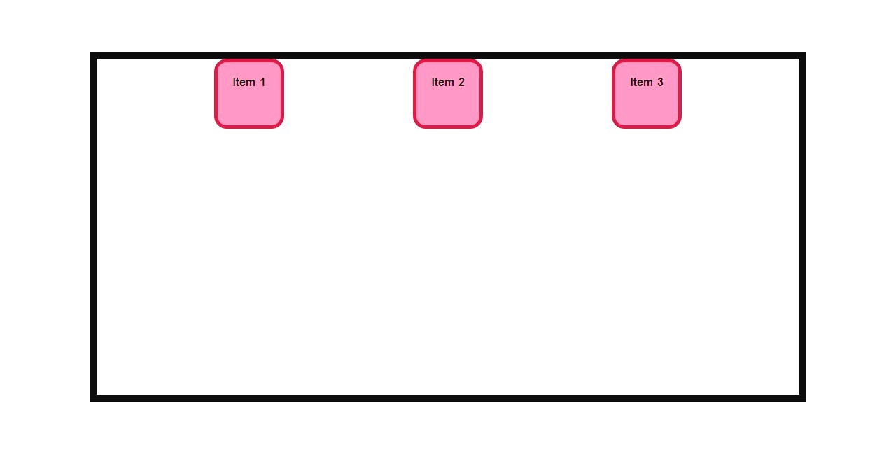
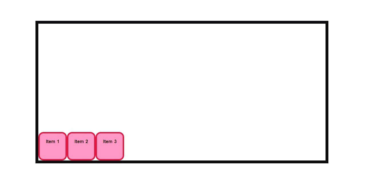
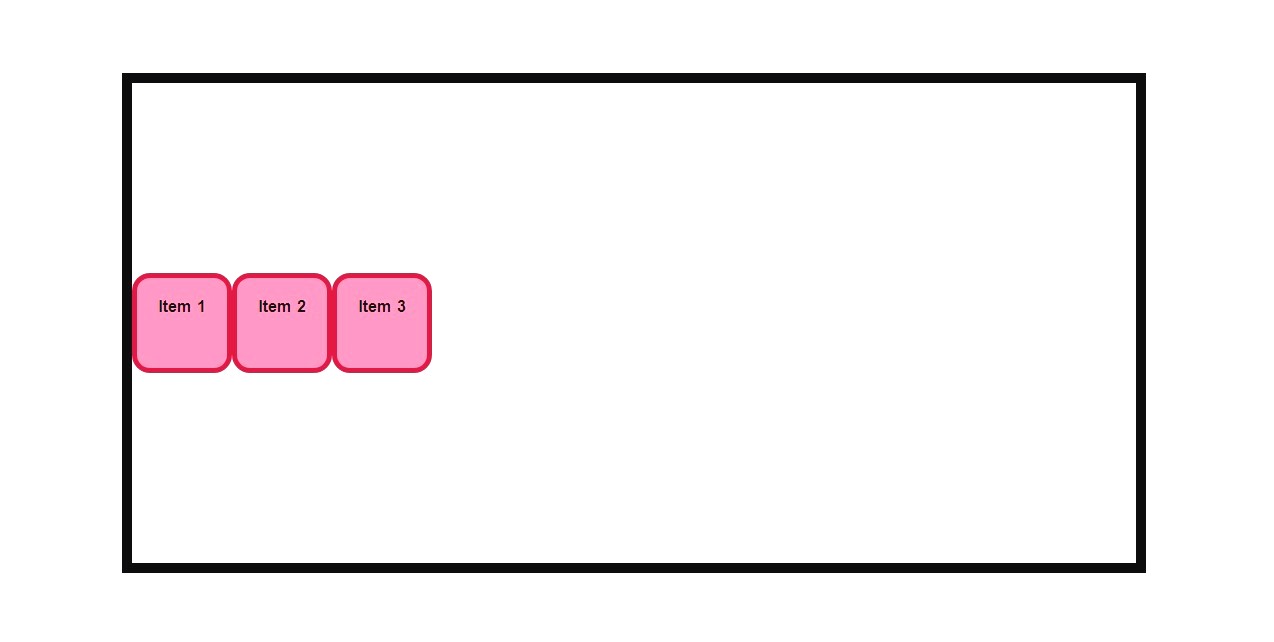
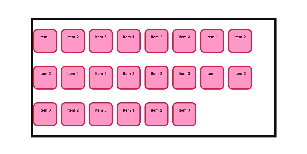
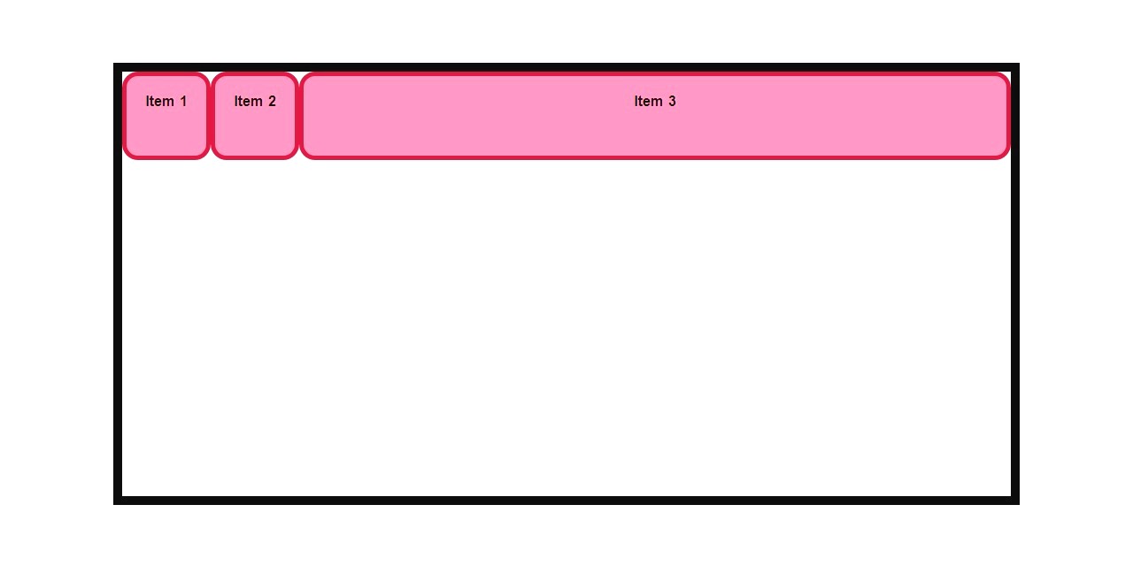
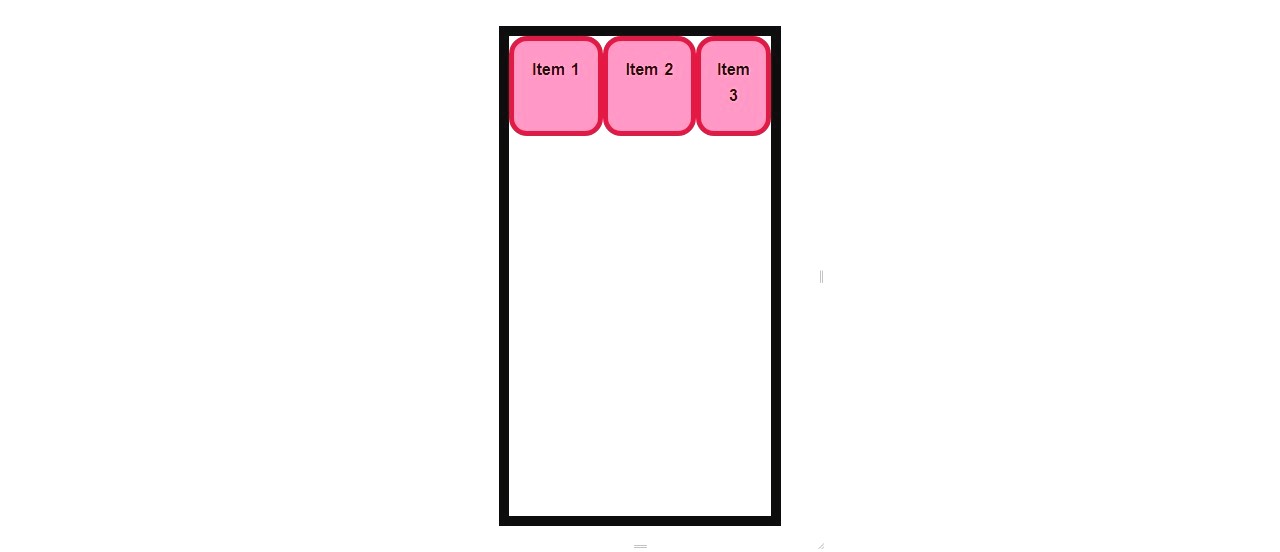
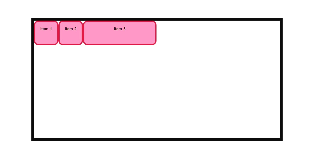
3. Flexbox Properties for the Container
The container uses Flexbox for alignment and spacing:
.container {
    display: flex;
    flex-direction: row;
    justify-content: center;
    align-items: center;
    gap: 1em;
}
Flexbox Properties:
- display: Makes the container a flex container.
- flex-direction: Controls the direction of the flex items (
row,column, etc.). - justify-content: Aligns items horizontally (e.g.,
center,space-between, etc.). - align-items: Aligns items vertically (e.g.,
center,stretch, etc.). - gap: Adds spacing between items.
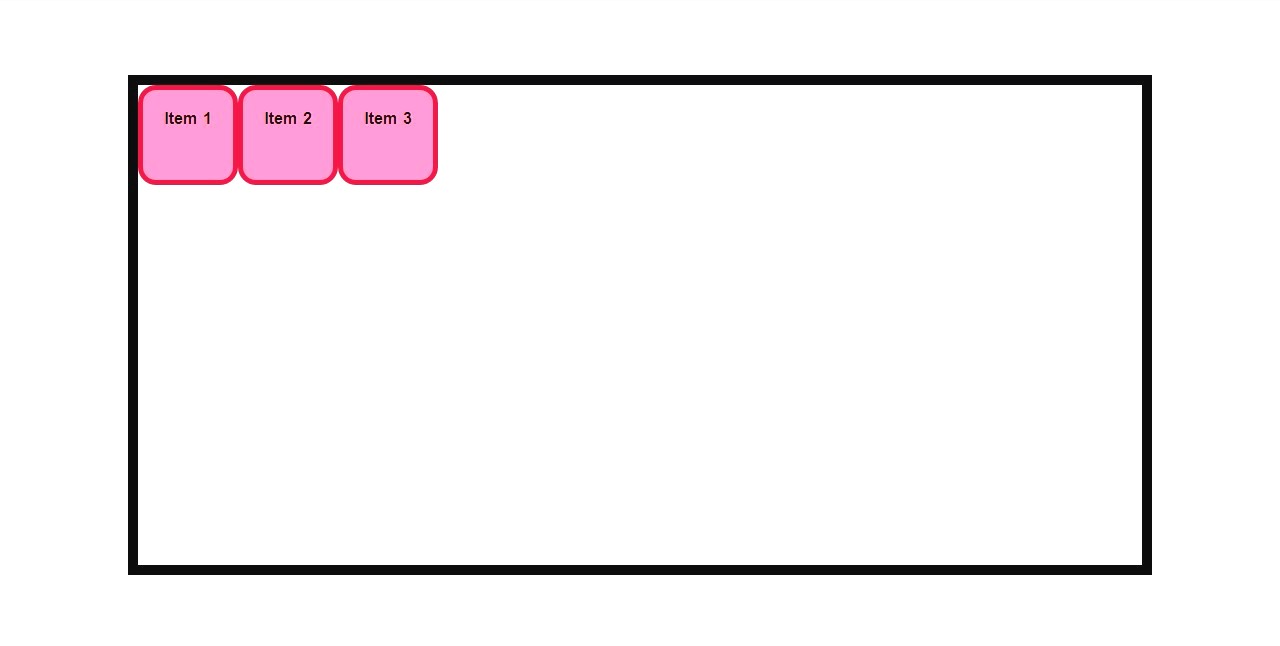
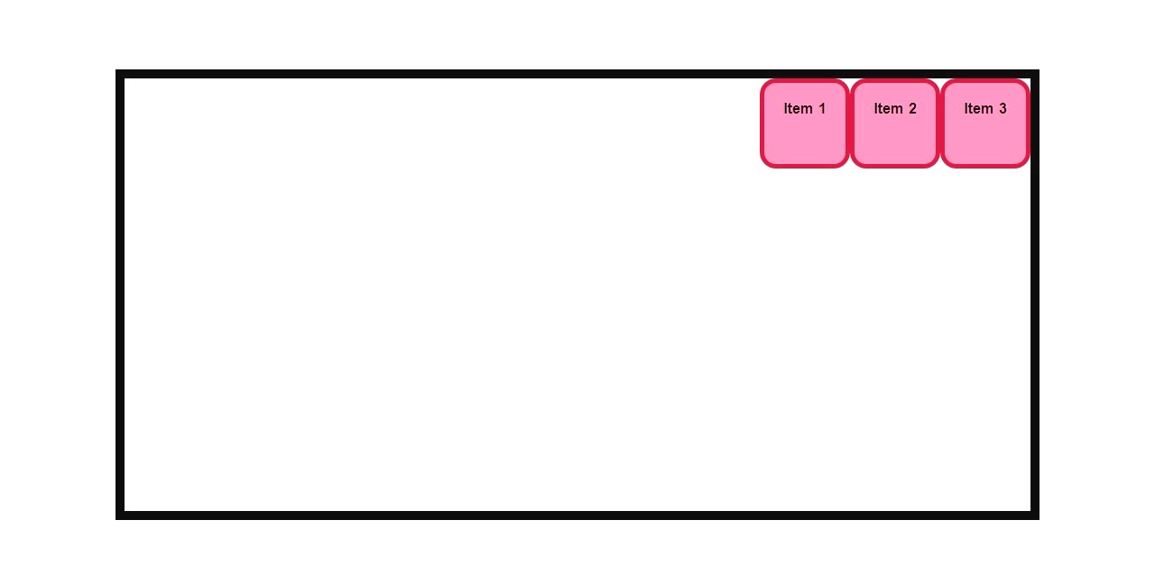
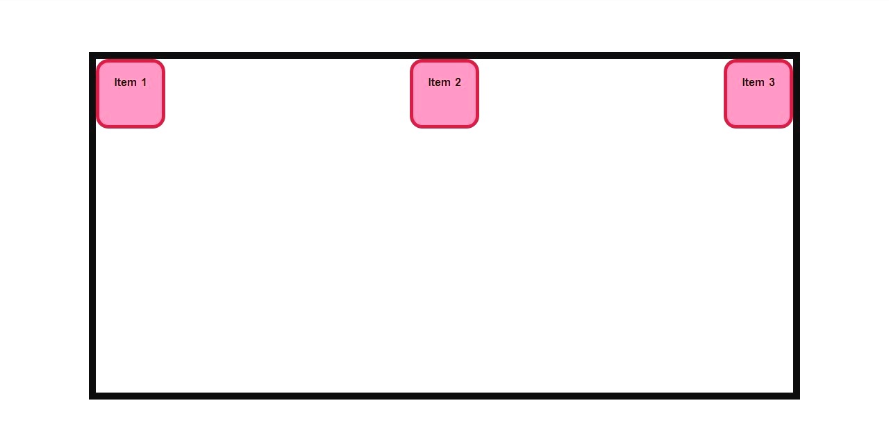
flex-direction: row
flex-direction: column
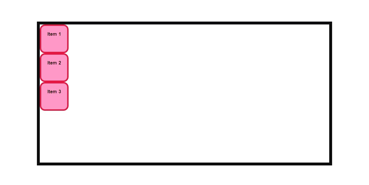
justify-content: flex-start;
justify-content: flex-end;
justify-content: center;

justify-content: space-between;
justify-content: space-around;
justify-content: space-evenly;
align-items: flex-start;
align-items: flex-end;
align-items: center;
align-items: stretch;
flex-wrap: nowrap;
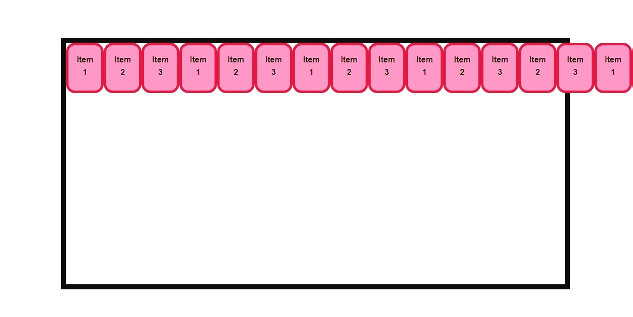
flex-wrap: wrap;
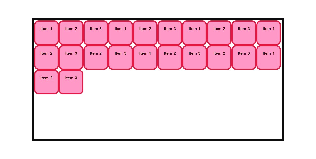
align-content: space-evenly;

gap: 1em;
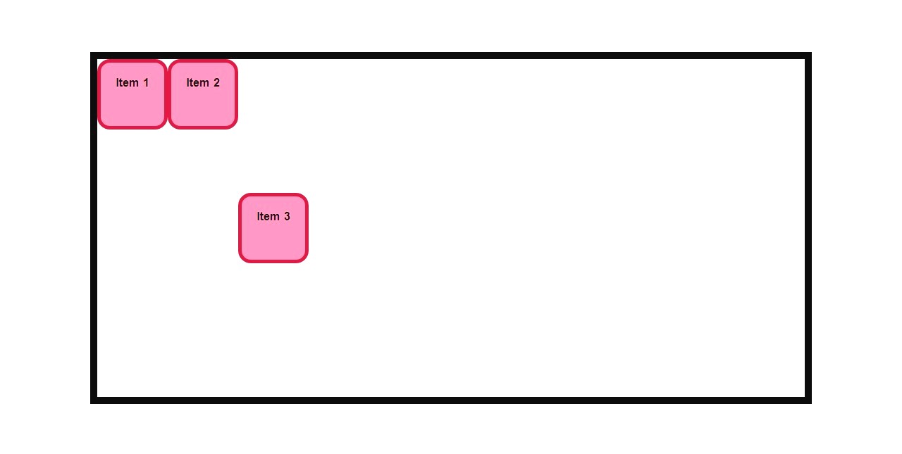
4. Advanced Item Properties
Individual flex items can be customized with the following properties:
.item-3 {
    flex-grow: 1;
    flex-shrink: 5;
    flex-basis: 300px;
    flex: 0 0 300px;
    align-self: center;
    order: -1;
}
Explanation:
- flex-grow: Controls how much the item grows relative to others (
1means grow to fill available space). - flex-shrink: Controls how much the item shrinks when space is limited.
- flex-basis: Sets the initial size of the item (e.g.,
300px). - flex: Shorthand for
flex-grow,flex-shrink, andflex-basis. - align-self: Aligns the item independently (e.g.,
center,flex-start). - order: Changes the visual order of the item (
-1moves it before others).
flex-grow:1;
flex-shrink:5;
flex-basis:300px;
flex: 1;
flex: 0 0 300px;
align-self: center;
order: -1;

5. Responsive Adjustments (Optional)
You can use media queries to adjust the layout for smaller screens:
@media (max-width: 768px) {
    .container {
        flex-direction: column;
    }
}